Thanks to Dr Mhairi Morris, Senior Lecturer in Biomedical Science at DMU, for this blog post:
A seedling of an idea and a new collaboration
I have worked with Julia and Kaye previously delivering a workshop to 2nd year Biomedical Science students using a creative writing approach to help them frame a scientific coursework essay, and in July I attended the Creative Connections workshop where I had great fun on Alison James’ “Lego Serious Play” session. So when the opportunity arose to submit a poster or workshop for the annual Vitae conference, I immediately asked Julia if she wanted to put together a workshop on visualising research using infographics. This was a topic we both had a growing interest in, and we brainstormed a few ideas and submitted the abstract. A few weeks later, we received a request from the conference organisers to combine our workshop with another similar submission from Sandy Sparks, Learning & Development Consultant for Research Active Staff (RAS) at the University of Warwick, and Lulu Pinney, an independent consultant and infographic designer. After a couple of Skype calls and a few emails back and forth, we had a plan for the workshop!
Setting the scene
On the day, the room venue changed a couple of times due to unforeseen issues with room size, availability of tables and a double booking! But we weren’t deterred, oh no, quite the opposite! Our new venue was to be the lovely Alexandra Suite; and like an oversized jumper, it turned out to be strangely comfortable (despite my initial active avoidance of standing at the lectern – it just seemed too formal for the occasion, but actually turned out to be ideal – what d’you know, the organisers knew best!).
Hello, my name is….
After the initial introductions, including likening ourselves metaphorically to various animals, Sandy asked the participants to brainstorm ideas of what they thought infographics were, and what they could be used for. Our attention was then turned to a selection of graphical abstracts which the participants were asked to evaluate and comment on. Interestingly, despite many of these abstracts being cited as “good examples”, the feeling in the room was very much underwhelmed and unimpressed with these examples. The major criticism was that these graphical abstracts failed to convey the content of the written abstract effectively, if at all. At this stage, we were a little uncertain as to the level of engagement in the room, leaving us wondering if we’d made a crass error!
Infographics in practice
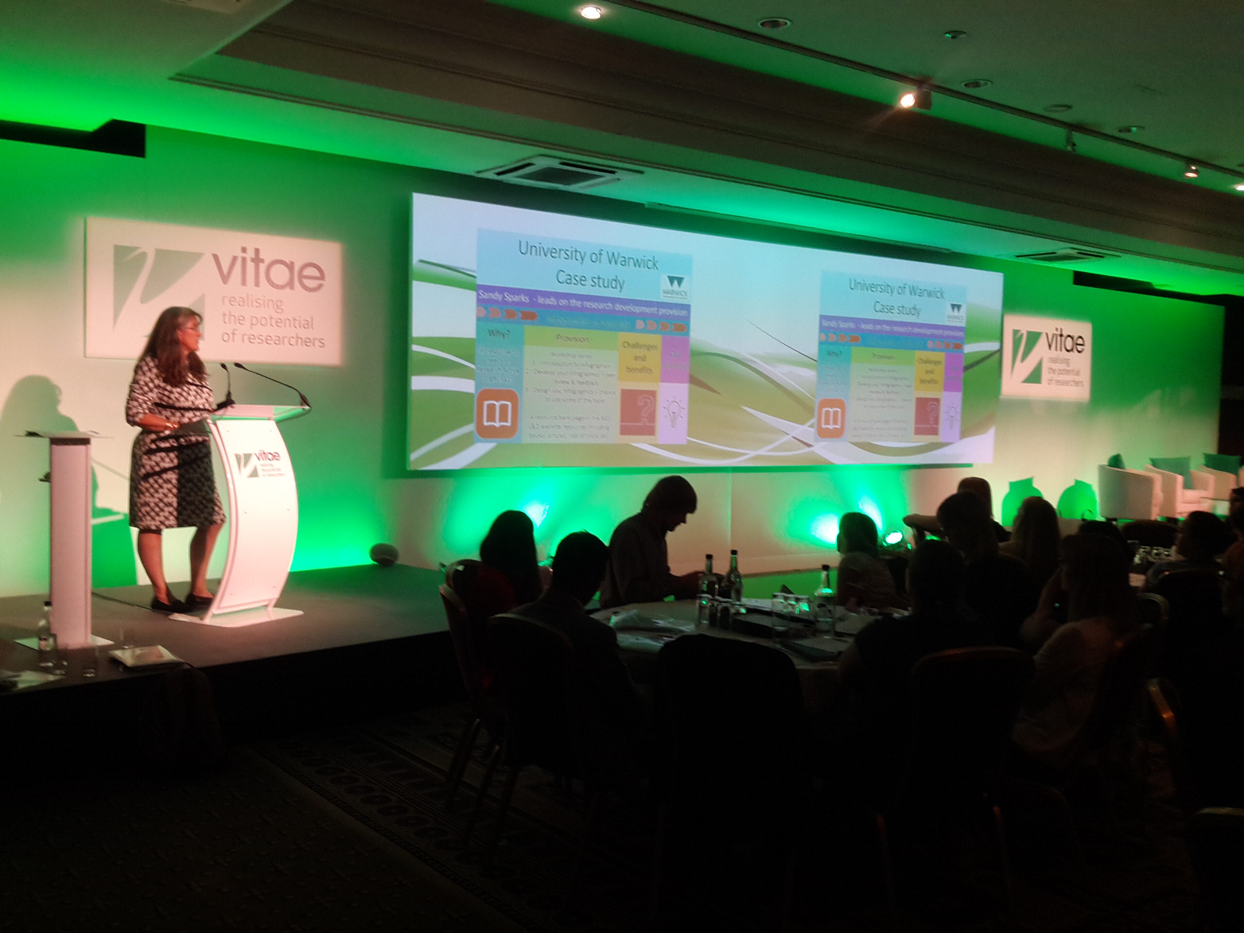
Sandy once again took to the podium and outlined a case study from her work at the University of Warwick, explaining that the training arose in response to a recognised need amongst research active staff. She explained a few of the challenges they faced, how infographics training had benefited their staff and some key lessons she’d learnt along the way. Following Sandy, Lulu spoke about her experiences of delivering infographics training, and offered some advice and tips for those looking to pursue this route further: rather than starting with, “I want to create an infographic – how do I do it?”, start with what you want to communicate and then consider whether infographics are really the best option since not every topic lends itself well to this form of visual communication.
Getting messy!
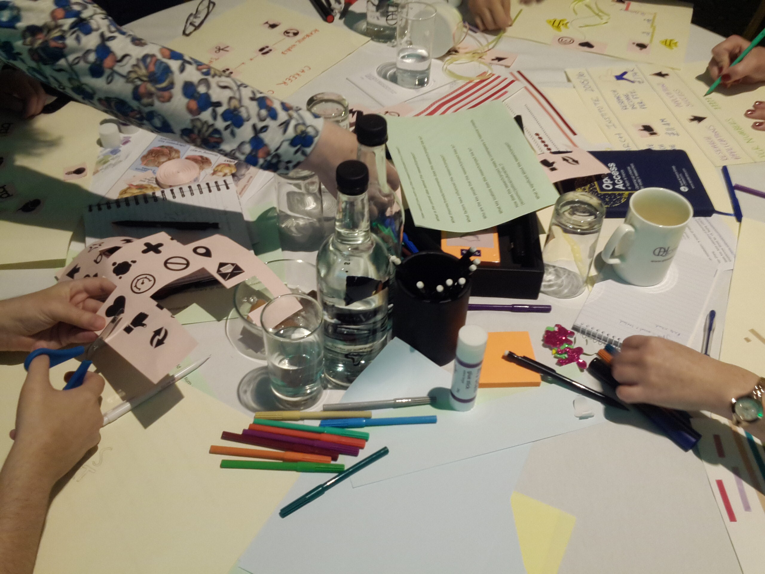
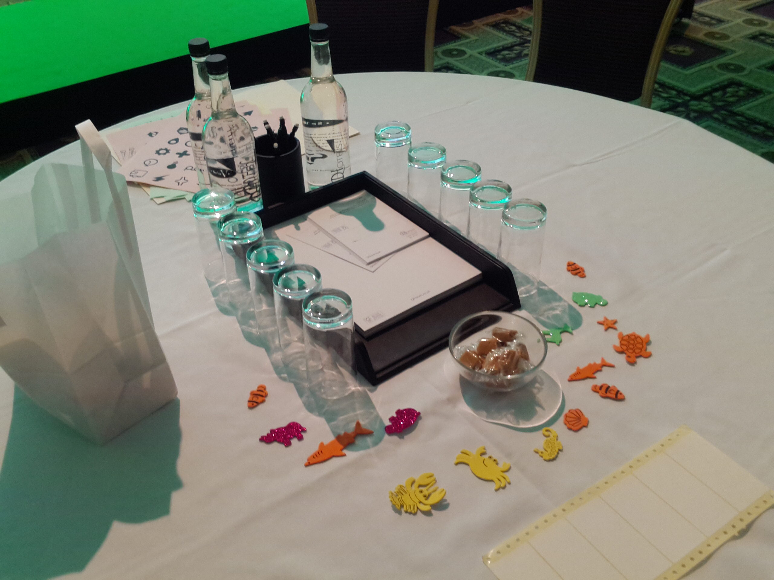
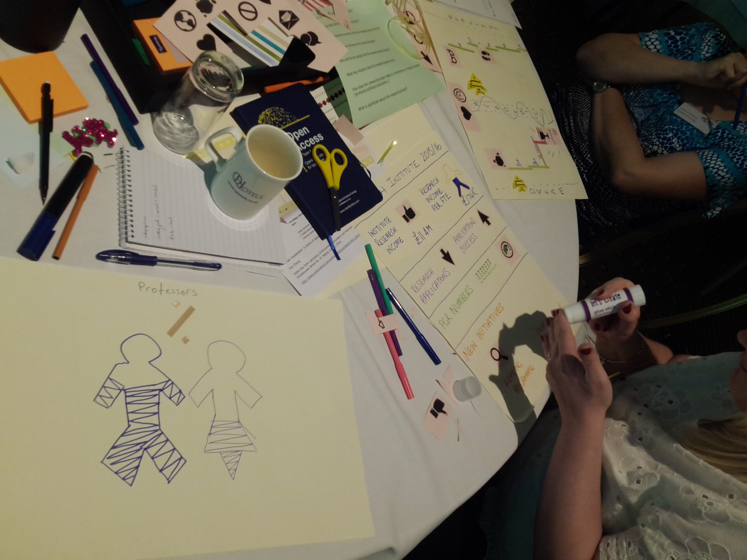
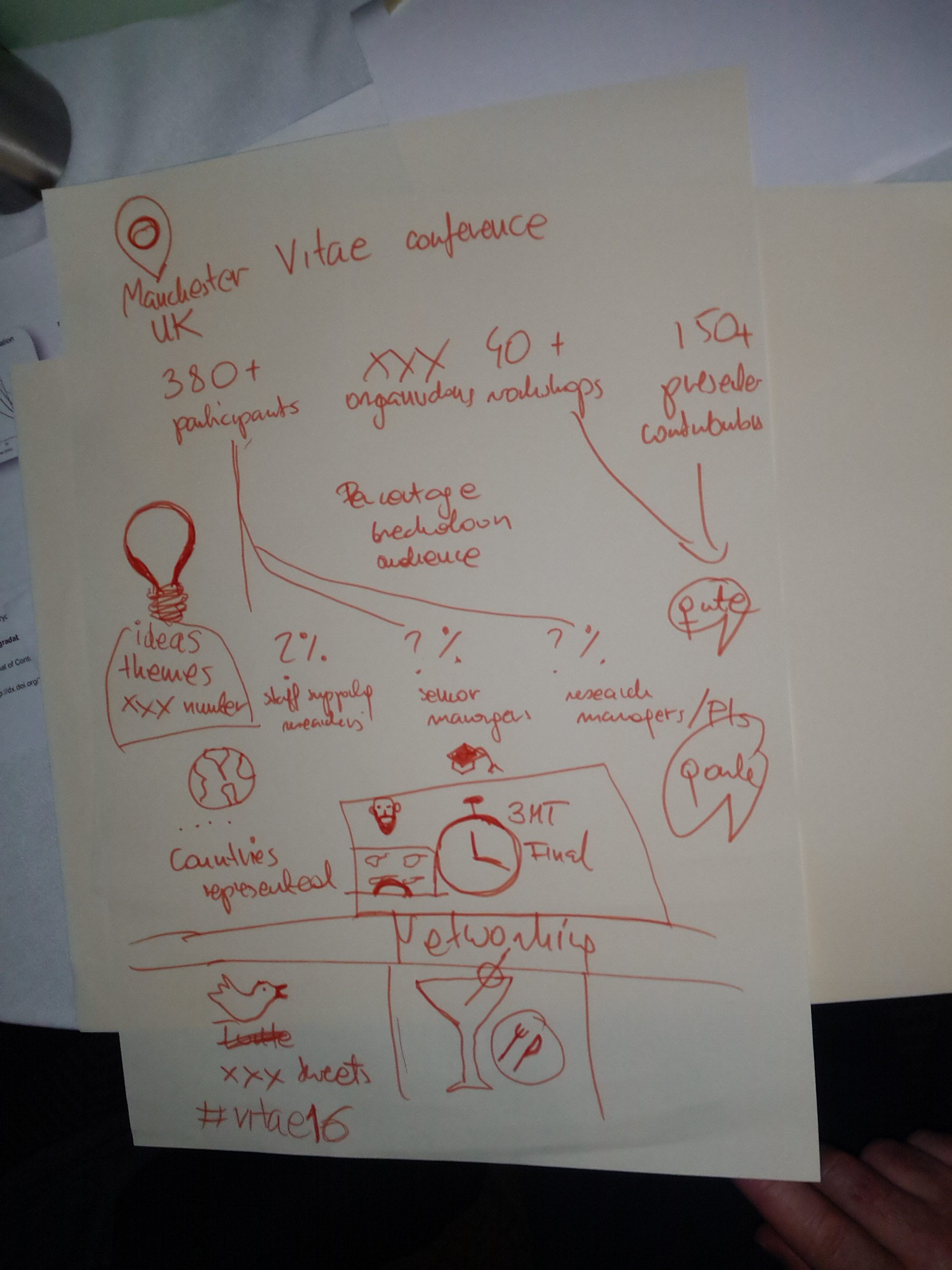
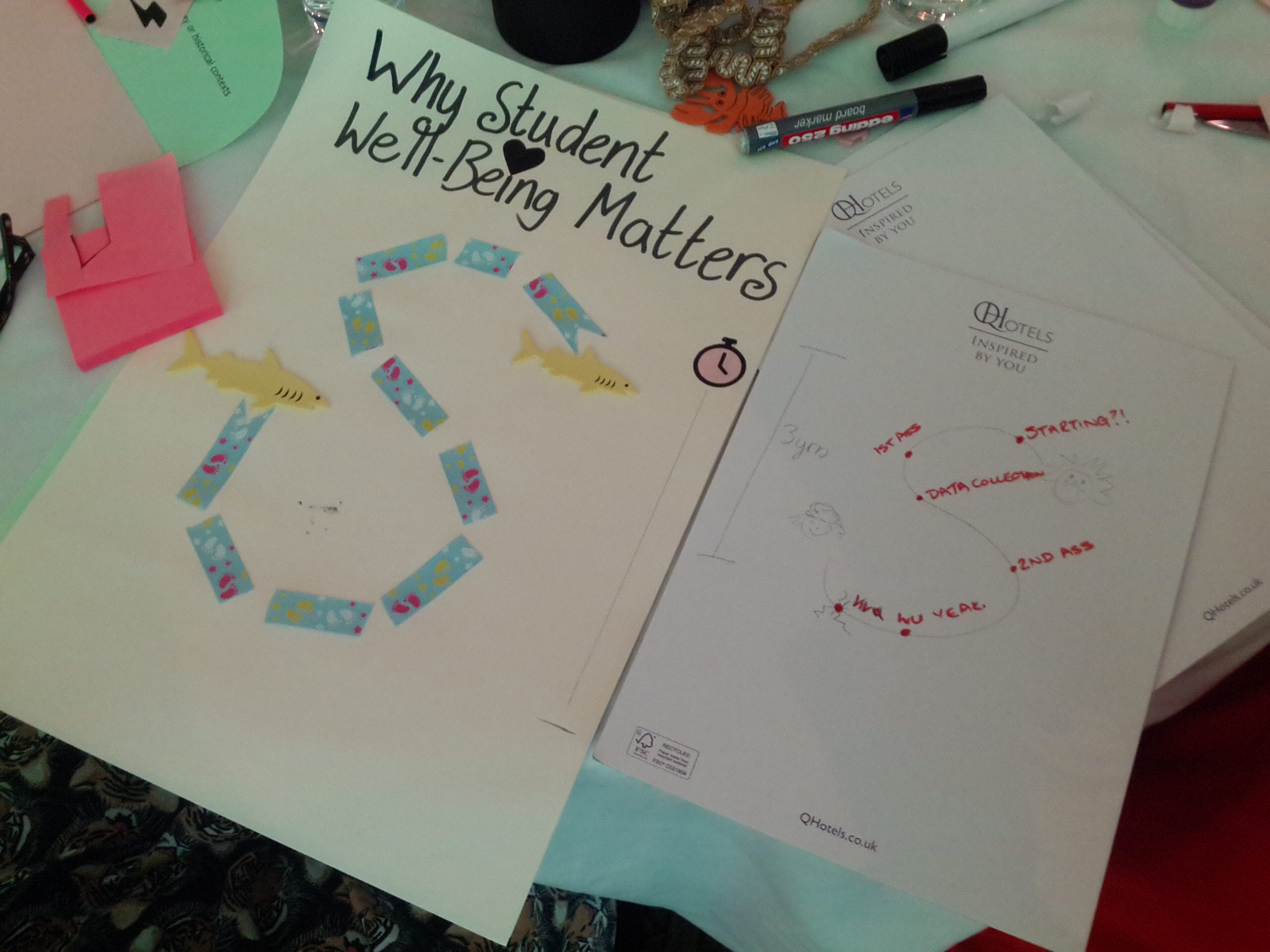
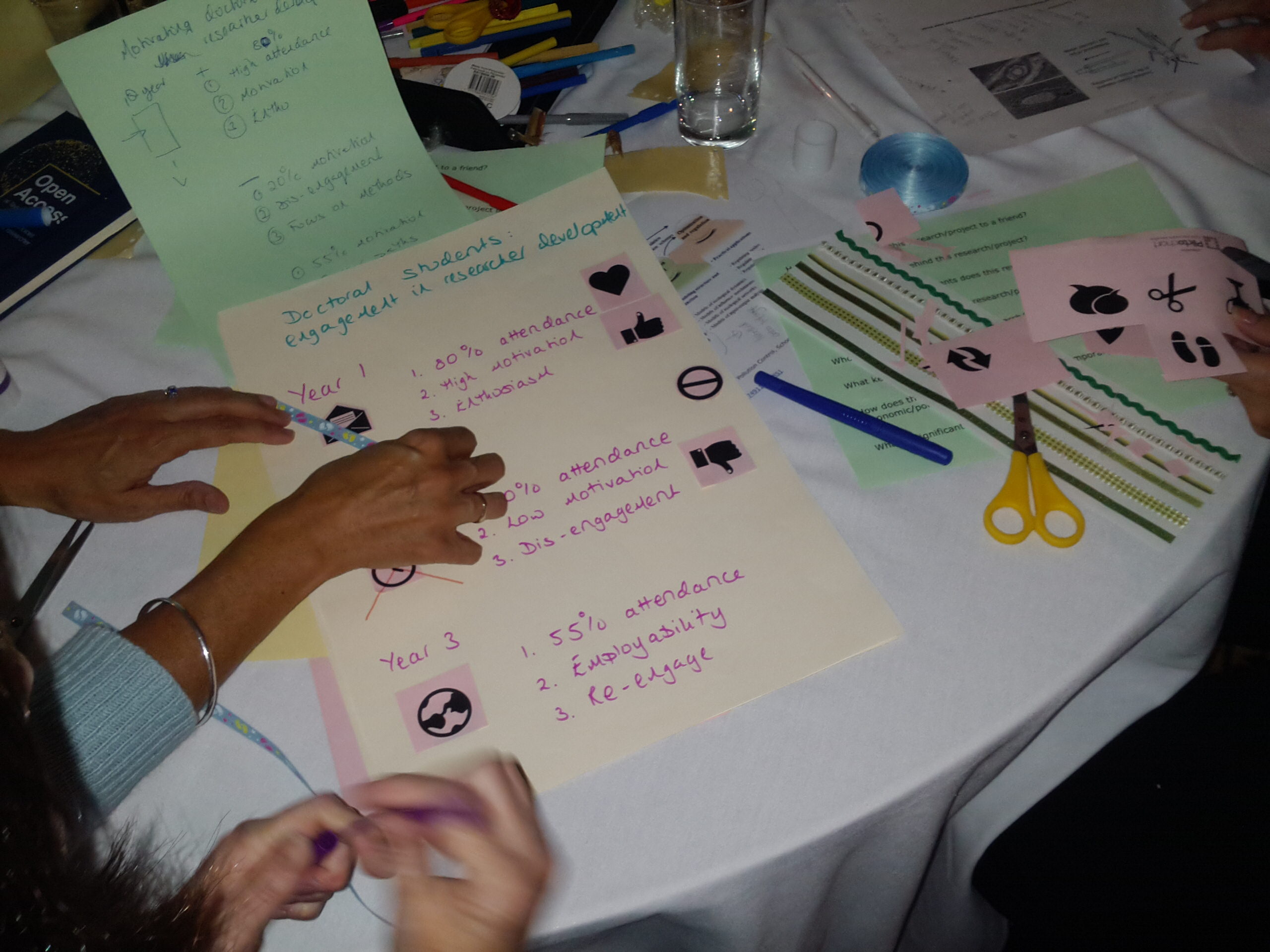
Then came the fun bit – getting “stuck in” and creating individual and group infographics to communicate a project of their choice using paper, felt pens, scissors, ribbon, miniature pegs, you name it! The diversity of the participants’ creations was incredibly inspiring.
The session appeared to have created a bit of a buzz, and this was reflected on the positive feedback we received and some of the Twitter activity that followed. Comments included:
“Great fun! Have tweeted. Learning: I want to use more animals/craft stuff in my workshops.”
“With a little imagination…”
“The simplest image can say 1000 words”
“Everyone interprets infographics differently! Visual, simple is best. Lots of fun today!”
“Great, simple, effective”
What next?
I’m writing this on the train home and reflecting over the past couple of days; what I’ve participated in myself and how our participants engaged with this infographics “taster session”. Julia and I have already got the next session penciled in the diary with early career researchers at DMU, and have discussed the possibility of creating a one-day workshop on visual communication for researchers, so keep an eye on this space and Twitter for more developments.
Dr Mhairi Morris