Thanks to Jillian Pawlyn, DMU Senior Lecturer – Learning Disabilities, for this blog post. Jillian uses the What, So What, Now What? framework to reflect on the development of an infographic, following an ‘Introduction to Infographics’ workshop delivered by myself as part of the CELT staff development offer.
What:
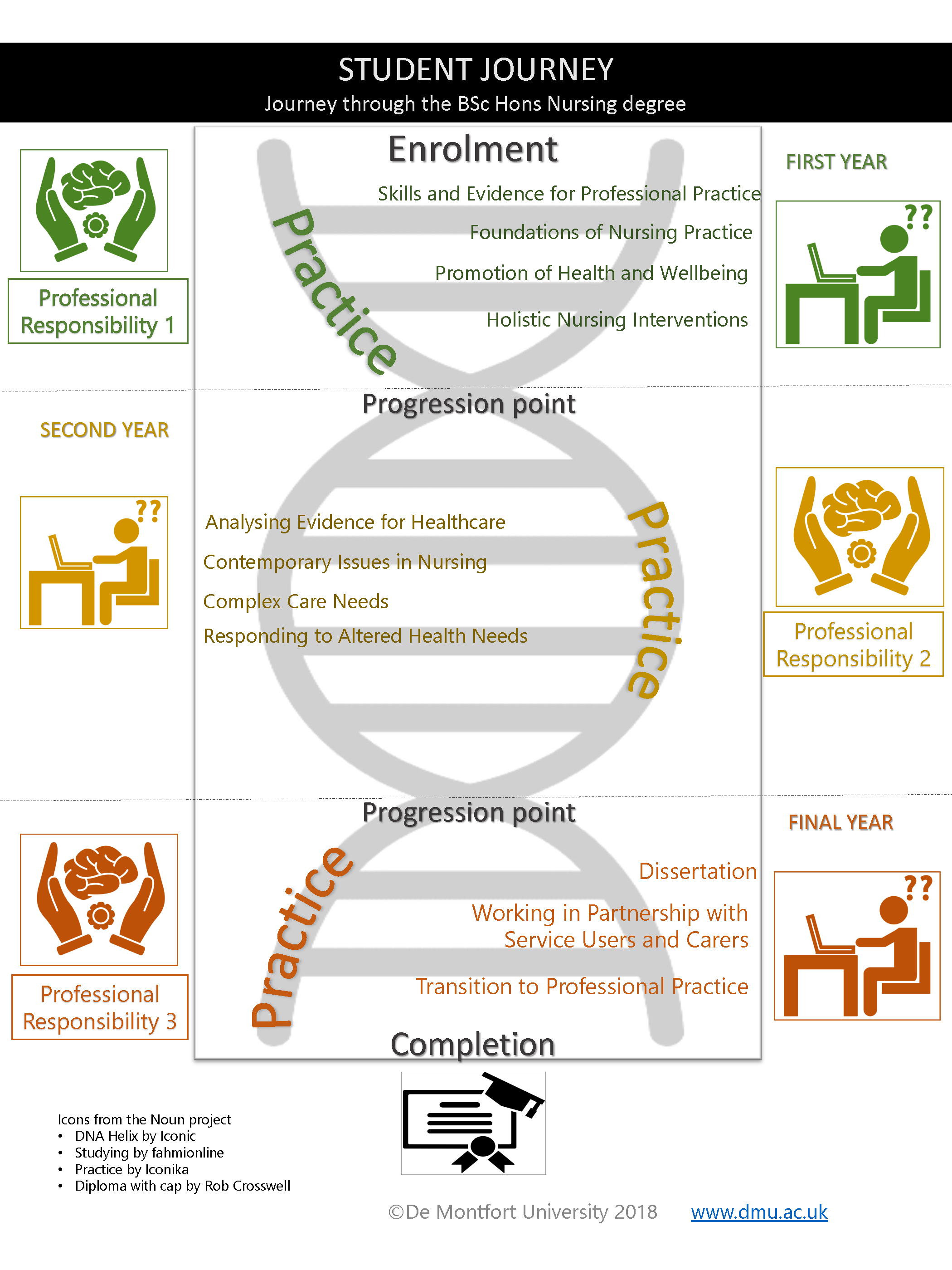
I wanted to create an Infographic to visually represent the student journey through the BSc Hons Nursing degree.
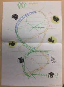
I signed up because I had a specific idea in mind. I was hoping to be introduced to a whizzy piece of technology which contained royalty-free icons which I could use during the workshop. What I was faced with was a welcoming smile and a table full of pens, various coloured sheets of paper, glue, scissors and pictures and icons to cut out to stick on the sheets of paper.
I was terrified, visibly so, with the facilitator’s encouragement and tactful guidance I took a piece of paper and slowly started trying to replicate the glorious image in my mind onto the blank paper in front of me.
Exhibit A – Hand-drawn Version
At the end of the session I presented my work to the group, (exhibit A, above)… and left the workshop with handouts and links to follow up to search for my ‘whizzy tech tool’. I went home and deliberated on how I could realise the idea on paper with the image in my mind to create something using the digital tools we have been introduced to during the session.
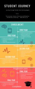
Back in my comfort zone, digital technology, I explored creating the poster using Canva.com (web interface) and PowerPoint template to create my first drafts. I circulated these to my colleagues for comments. They suggested minor revisions and clearly favoured the presentation of the PowerPoint over the Canva template (image below) (I used a free template so it is limited, I found Canva very easy to use).
Version 2 completed using Canva
I undertook the revisions on the PowerPoint resource resulting in this version (image below), this has been returned to my colleagues for final approval.
Version 3 using PowerPoint
So what:
I consider myself ‘artistically-challenged’.
I came to the workshop with a vision of what the infographic would look like in my mind but I struggled to relate to the blank piece of paper.
I recognise that I was over eager to just get it done, the idea for the poster has been on my ‘to do’ list for so long, I saw the workshop as the chance to finish the work rather that start the work.
I have learned that I need to trust myself more, paper and glue and pens should be fun. I admit at the end of the session I was enjoying myself more than I thought I could.
Now what:
I am still waiting for final sign up on this within the team. So this work is not yet signed off.
Personally I am very proud of the final artefact, my intention is for it to be web deployed so it has hyperlinks to the relevant content in the DMU Website for current and prospective student use.
I remind myself of my daily quote: “Be brave. Take risks. Nothing can substitute experience” Paulo Coelho.
What, So what, Now what? framework of reflection.
Borton, T. (1970) Reach Touch and Teach, London: Hutchinson cited in Jasper, M. (2003) Beginning Reflective Practice, Cheltenham: Nelson Thornes.
Fascinating to see the evolution of Jillian’s infographic design from paper-based through to digital versions and to read her reflections on the physical/digital divide. DMU staff can book onto ‘Introduction to Infographics’ workshops via My Development.